Website and responsive design services have become essential for the success of businesses and brands in today’s digital world. Every scale of business needs a professional website to reach its customers online, promote its services and products, enhance customer interaction, and expand brand awareness. At this point, web design and responsive design services aim to provide users with a flawless experience both aesthetically and functionally.
What is Website Design?
Website design refers to the creation of a user-friendly and visually appealing platform that reflects a brand's digital identity. Website design is extremely important not only for aesthetics but also for usability and accessibility. A well-designed website allows visitors to easily access the information they need, helping them spend more time on the site and build a strong connection with the brand. Website design should be structured according to the overall business objectives of the company and should exhibit a user-centered approach. The colors, fonts, graphics, and other visual elements used in the design process should be consistent with the brand’s identity and integrated in a way that captures visitors' attention. At the same time, the content added to the site should be organized according to SEO (Search Engine Optimization) criteria to ensure that the site ranks high on search engines. This way, brands can reach their target audiences more broadly.
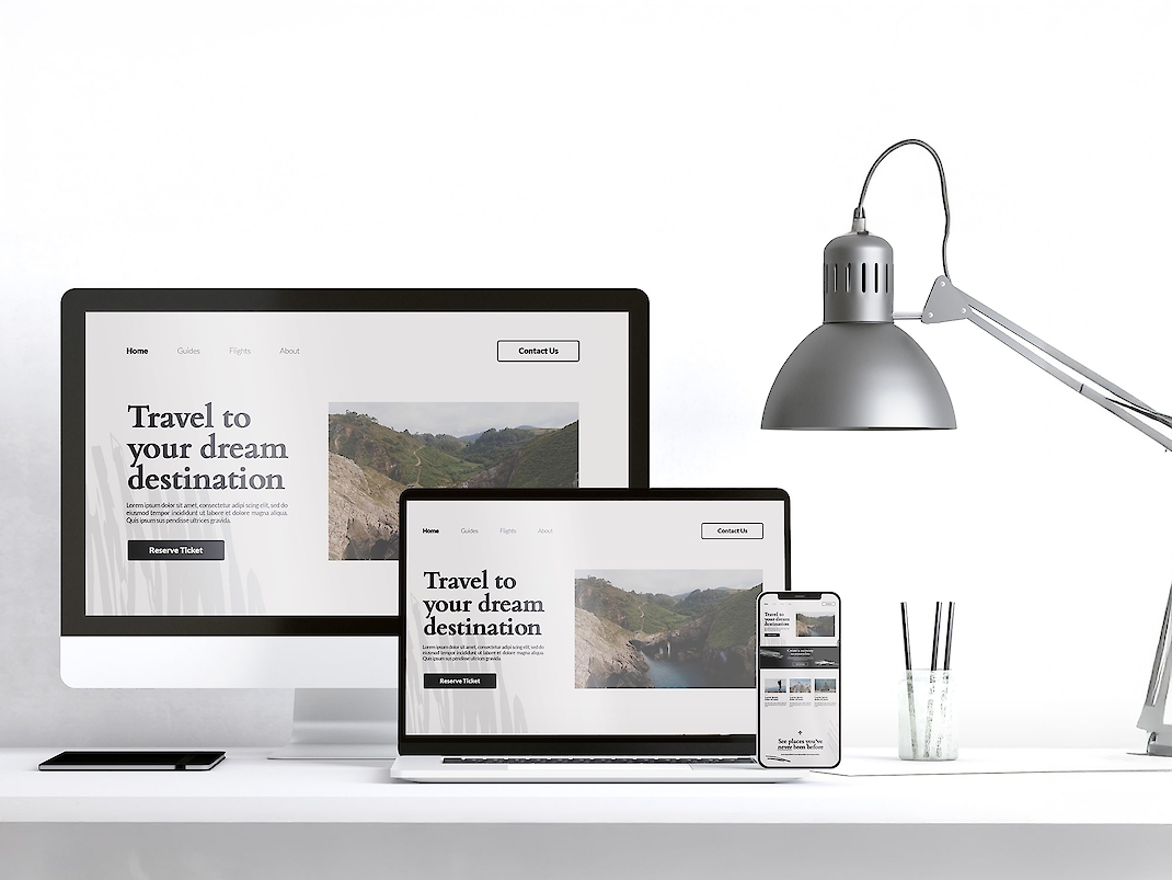
What is Responsive Design?
Responsive design is a design technique that ensures a website is displayed seamlessly across different devices (computers, tablets, phones, etc.). Today, a significant portion of internet users visit websites through mobile devices. Therefore, it is crucial for a website to be optimized not only for desktop computers but for all devices. The primary goal of responsive design is to maximize user experience. This allows the site to automatically adapt to the screen size, resolution, and device used. In other words, regardless of the device users enter the site from, they can easily access the content and navigate the site comfortably. Responsive designs also optimize the loading speed of the site and positively impact SEO performance.
Benefits of Website and Responsive Design
- Improves User Experience: Responsive designs work seamlessly on all devices, making it easier for visitors to use the site. This increases user satisfaction and raises the likelihood of visitors returning to the site.
- Enhances SEO Performance: Google and other search engines prioritize mobile-friendly sites in their rankings. A responsive site achieves better rankings on search engines, increasing organic traffic.
- Enables Reaching a Broader Audience: With the increasing number of mobile users, responsive design meets the needs of users accessing from mobile devices, allowing brands to reach a larger audience.
- Ease of Maintenance: A single responsive site eliminates the need to manage separate mobile or desktop sites, reducing maintenance costs and time.
- Fast Loading Times: Well-optimized responsive designs provide fast loading times. Sites that load quickly are more appealing to users and advantageous from an SEO perspective.
- Competitive Advantage: For brands that want to establish a strong presence in the digital world, a website and responsive design are among the most effective ways to stand out in competition. A site that offers a good user experience and accessibility allows for a step ahead of competitors.
Elements of Website and Responsive Design
- User Interface (UI) Design: User interface defines the visual elements of a website and how users interact with the site. A good UI design should be aesthetically pleasing and user-friendly.
- User Experience (UX) Design: UX design focuses on how users experience the site. It should provide smooth navigation and an intuitive structure to ensure users can use the site effortlessly and enjoyably.
- SEO-Compatible Content: The content on the website should be easily discoverable by search engines. Keywords should be used correctly, and the content structure should be aligned with search engine algorithms.
- Mobile-Friendly Design: It should provide an excellent experience when accessed from mobile devices, being fast and user-friendly. All pages and content should be displayed correctly on mobile device screens.
- Visual Quality: The visuals on the website should be high-resolution and professionally prepared. However, these visuals should not slow down the site; they should be used with optimized file sizes.
Website and Responsive Design Process
- Analysis and Planning: A detailed analysis is conducted to understand customer needs and goals. A sector analysis and competitor review are performed to develop the most suitable strategy for the project.
- Design: During the design process, a visual language suitable for the brand’s identity and a user-friendly interface are created. The design is optimized for both mobile and desktop devices.
- Development: After the design phase, the site coding phase begins. The site is implemented using HTML, CSS, and JavaScript in accordance with responsive design principles.
- Testing: Tests are conducted to check whether the website functions smoothly on different devices and browsers. Additionally, site speed tests and SEO analyses are performed.
- Publication and Maintenance: After the website is launched, regular maintenance and updates are conducted. In the ongoing process, performance analyses are carried out, and improvements are made if necessary.